YOG2010. "SPIRIT OF YOUTH": THE START OF A NEW TRADITIONThe International Olympic Committee (IOC) Session in Guatemala City approved the creation of the Youth Olympic Games (YOG) for the first time in the history of the Olympic movement. The YOG was conceived with equal emphasis on sport, culture and education.
On 21 February 2008, Singapore was elected the host city of the inaugural YOG out of the nine cities that had applied. Athens, Bangkok, Moscow, Singapore and Turin made it to the shortlist, which was later reduced to two finalists: Singapore and Moscow. Singapore won by nine votes (53 against 44).
From 14 to 26 August 2010, the 2010 Singapore YOG will receive some 5,000 athletes and more than 500,000 spectators. Athletes from 14 to 18 years of age will compete in 26 sports and take part in a Culture and Education Programme. Each event is divided into different age group categories – 15 to 16 years, 16 to 17 years, or 17 to18 years – and some events have been adapted for youth.
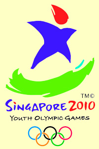
The 2010 Singapore YOG logo – “Spirit of Youth” – consists of the three following elements:
- The Flame of Passion in intense red, which is the national colour of Singapore;
- The Star of Champions in rich purple, which symbolises the excellence and pride of representing one’s country;
- The Crescent of Tomorrow, which reflects a dynamic youth full of promise, in the lush green and calm blue colours of a tropical island city.
The Lingua Franca of he Sports World
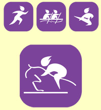
Sports pictograms are a visual language, recognisable by anyone, as they depict the human body in postures most characteristic of each sport.
During the preparation for the Tokyo Games of 1964, it became clear that notice boards with Japanese characters and their translations would be too busy and confusing for international guests. Therefore, Japanese graphic designer Masaru Katsumie came up with the idea of using stylised depictions of sportsmen. Ever since then, sports pictograms have become part and parcel of every Olympic Games.
The YOG sports pictograms have a contemporary graphic style. They feature the Spirit of Youth participating in each of the 26 sports of the YOG.
The aesthetic competence of graphic designers is most obvious in images that contain rich cultural connotations of their host country. Here, we present some of the most striking sports icons to date.
1980 Moscow Summer Games
These pictograms were created by a young architect named Nikolai Belkov, a graduate of Mukhina Art School in Leningrad (the old name of St. Petersburg). Though highly stylised, the signs are easily comprehensible. They are smoother in outline because they are constructed at an angle of 30 to 60 degrees (in previous pictograms, the angle was 5 to 90 degrees).
1994 Lillehammer Winter Games
These images initiated a new style in Olympian graphics. They are based on Scandinavian rock paintings – petroglyphs. Despite their somewhat awkward and angular lines, these pictograms may be easily read. They had been considered the most original among their peers, that is, until the images for Beijing Olympics were created.
2008 Beijing Summer Games
These are simple yet highly aesthetically-pleasing images based on Jingwen, the script found on 2,000-year-old carved bronze and bone objects in ancient China. The creative team of famous designer, Min Wang, skilfully used the sharp contrast between black and white, which is typical of Chinese artistic tradition.
|
 +65 6696 7068
 info@meridian103.com
 PDA
PDA